Instagram Launched A New Font That Might Make You Do A Double-Take
I guess it’s time to learn what a squircle is.
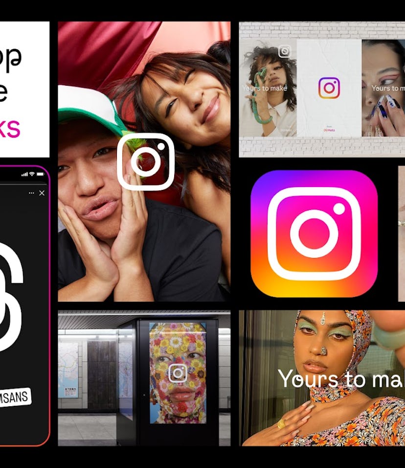
No, you’re not imagining things — your Instagram looks different. If you’ve noticed some subtle changes to the app recently, that’s because Instagram hit refresh on its font and logo. Your go-to spot to share your fave pics and create Stories quietly added a new font option called Instagram Sans. The new-new on your app was also accompanied by a reimagined logo with more vibrant colors. To help you keep up with the changes, you probably want to know where to find Instagram’s new font for 2022. Here’s what to know about the newest option and everything you can do with it on the app.
The update went live on May 23 and has since been popping up on Stories and Reels in the form of text, location tags, hashtags, and mentions. Instagram’s newest font, Instagram Sans, looks similar to the still-available Comic Sans, but new self-named font has its own unique vibe. According to Meta, the Instagram Sans replaced the “Modern” style in the type tool on Stories. “Instagram Sans is a contemporary remix of grotesque and geometric styles,” per a Meta announcement about the change. To try out the font yourself, begin creating a Story or Reel and add text over it. You’ll see the font appear as the first option in the typeface line-up.
You’ll also see it as the font for stickers like “Location” and when you mention other IG users in your Story or Reel. Since it’s not too big of a change, you may wonder if you’re seeing things, but once you get used to it, you’ll notice the font’s as the newcomer that it is.
The minimalist, rounded wordmark is the “in-between” of a circle and a square, which Instagram calls the “squircle.” With a self-named font, the company paid attention to every detail, like the cursive flick of the letter “Q” and the teardrop in the “a,” which Meta attributes to the font’s “friendly personality.”
Meta also produced new global scripts that include Korean, Arabic, and Kannada in order to make the app more accessible for users around the world. More than 40 typographers and language experts were consulted to make these options a reality.
In conjunction with the font refresh, the ever-present camera logo of Instagram also got a new look, kinda. The logo’s core design hasn’t changed, but the color gradient was revamped by London-based artist Rose Pilkington with the goal to “enhance, refresh, and illuminate,” according to Pilkington’s Instagram post. The rainbow gradient is made up of hues of yellow, orange, pink, lavender, and purple, and designed “using an innovative 3D modeling process to make it feel illuminated and alive.”
Instagram isn’t only making changes in your Stories. You may have also noticed a push to make video to the front and center (and if you can change it back to the OG layout), as a well as more interactive DMs. TL;DR: there’s a lot going on in your IG app, so make sure you’re app is updated for you to check out all the new happenings.