The Twitterverse Is Not Here For Twitter's New Desktop Layout
Not all updates are an improvement, as the Twitterverse discovered when Twitter first debuted an unexpected change-up on the platform on Tuesday, April 23. When viewed from laptop or your computer, the social media app now functions and looks completely different — and the tweets about Twitter’s new desktop layout are not having its latest makeover. Here's what people are saying, as well as how to get your view back to "legacy" mode if you're not ready to jump on board yet (or ever). Elite Daily reached out to Twitter for comment on the redesign as well as users' reactions to the update, but did not hear back by the time of publication.
The tech giant, which first announced the redesign plans back in January, quietly rolled out the updates to a few select users with the option to opt-in for others. Not everyone automatically got the new interface, and when I opened up the Twitter interface on my desktop, I had to choose to update by selecting the option in a column on the left. According to various news outlets, the company is actually testing out two different looks and is hoping to get feedback on both of them, so there's no telling which one you've been selected to try out until you open up the page on your desktop.
The first thing I noticed is that the layout and design seems to be focused on simplicity, almost like Twitter's mobile app. Per CNET, you'll either see a layout with two or three columns, which the company assigned randomly when it rolled out the revamp. When I switched over, I got two columns with the timeline on the left while the trending topics and follow suggestions populated on the right.
According to the publication, there's also a second layout that's being shopped around that includes a third column that houses the buttons to check out notifications, messages, bookmarks, links, and more.
There are also some changes in function associated with the redesign, as you now have the option to show your latest tweets first, switch your background to dark mode, as well as to change the size of your font. In addition to the new look, there are also some differences in functionality. For instance, when I went to copy a tweet, I was sent to a different page to complete the action, making it a lot harder than it needed to be.
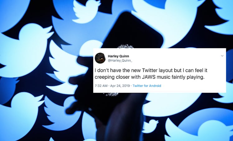
The Twitterverse shared its opinions on the platform's new makeover, and based on the responses, it's overwhelmingly not feeling the change.
Despite the sleeker, mobile-inspired design, many users are complaining about how some of the features make their feeds more cluttered and difficult to navigate. For example, some people aired their frustration that they were now seeing the tweets of people they didn't follow, simply because these accounts were followed by people that they themselves followed. In addition, a few tweeters complained that they'd rather not see the trending topics or "who to follow" suggestions so prominently placed.
As of now, it's unclear whether Twitter plans to roll back the updated interface or update its existing look based on customer feedback, but the tech company didn't respond to an Elite Daily inquiry about the future of the desktop update. In the meantime, you can choose to opt out by going to settings and selecting "Switch to legacy Twitter."
Twitter's latest redesign comes as it works to increase its number of active users. On Tuesday, April 23, the social media platform announced that it had experienced a boost from 321 million in its fourth quarter to 330 million in its first quarter. The planned redesign was meant to continue that upward trend, but from the sounds of things, it looks like the Twitterverse wants the developers and designers over at the tech giant to head back to the drawing table.