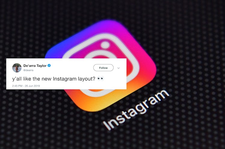
People Have Questions About Instagram's Updated Layout
Every now and then, a social media platform takes a bit of a risk and changes up its layout. Whenever this happens, there seems to be an initial chaotic reaction, where people don't know what happened. Then, people usually call for a switch back to the old layout. Finally, people tend to get comfortable with the new look, since they really have no other option. Instagram is the latest social media platform to change its layout, and it seems like most Instagram users are still not used to it. These tweets about Instagram's new profile layout all ask the same question: Why?
On June 26, some Instagram users began noticing a brand new layout that, while not wildly different, definitely has some significant changes from its most recent look. In an email to Elite Daily, and Instagram spokesperson says:
In November, we began testing new designs for profile that let you better express yourself and connect more easily with the people you care about. Based on community feedback, we’ve rolled out a design with a cleaner look and feel as well as new profile tabs for IGTV and shopping. As with the test, the photos and videos you've shared on your grid won't change.
For users who noticed the apparent update, it appears the scroll option is completely gone from individual profiles, so you can only see your pictures in the grid format, which is great news if you spend a lot of time curating your grid for cohesion. You can also swipe between the grid and pictures you are tagged in, and, for some users, it appears there's an IGTV shortcut where the scroll option used to be.
The profile layout also seems a little roomier in general — there appears to be more negative space between your username up top and the top of your highlights, making your bio, Highlights, and profile picture a little easier on the eyes. From the comparison of the old layout to the new layout, when looking at someone else's profile, it seems like Instagram moved the "Message" button (or "Edit Profile" button if you're looking at your own page) down from below the "Posts" and "Follower" numbers to below your bio, leaving a ton of blank space between "Posts," "Followers," "Following," and where your bio starts.
It seems like this update only contains a few tweaks, but people are definitely noticing. As the layout update rolls out to more Instagram users, one thing is becoming pretty clear: Many people don't seem to like it.
Many people seemed to think Instagram has changed its layout far too many times recently, like Twitter user @RealYungYak who wrote, "Stop doing updates. Stop. Please. Nobody wants changed platform layouts 5 times a year," or Twitter user @tessneem who wrote, "[M]y profile looks different every WEEK can they just pick a layout and stick with it sheesh."
There were a few scattered voices here and there that actually had positive things to say about the new layout, like Twitter user @bellmorleys, who wrote, "[T]he new layout on Instagram profiles feels so neat."
Another Twitter user, @gretchenho, wrote that while the layout takes some time to get used to, it makes accessing IGTV easier and also makes it easier browsing through past posts.
If you don't see an update on your Instagram app, it may be because you're not getting automatic updates. You can always check if you have an update available in the App Store or Google Play.
Although many people dislike the layout now, Instagram users will likely get used to it and come to terms with the changes. Such is the life cycle of a social media update, right? Hopefully, the people who are having trouble navigating the changes will be able to figure them out soon enough.