Twitter Is Calling Out The New Chargers Logo For Being 'Lazy' And 'Lame'
If you haven't already heard the news, the San Diego Chargers are relocating to Los Angeles.
That's right, after playing 56 long seasons in San Diego, the Chargers are ditching their once-loyal fans to set their sights on taking over the city of angels along with the Rams.
I think the general message sports fans are sending the NFL is they are not happy. Not only are fans protesting outside of the Chargers' headquarters, but one guy actually egged the building!
Um, yeah, don't mess with San Diegans. They're PISSED.
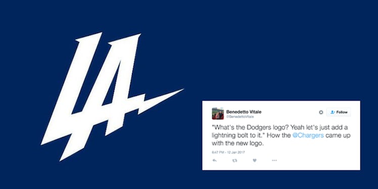
In addition to sports fans disapproving of the decision to relocate the Chargers to Los Angeles, people really hate the team's new logo, too.
If you haven't seen it yet, just think of an LA Dodgers logo with a tiny twist.
Here's the new logo for the Los Angeles Chargers. Does this remind you of anything?
I'm not sure about what you see, but I see a Dodgers logo.
Evidently, the Twitter community agrees. The new Chargers logo is a pretty damn lazy attempt at a team rebrand!
The jokes just kept pouring in.
I love Twitter.
This one hit the nail right on the head.
Perhaps the only good thing about the new Chargers logo is the fact it's so easy to customize.
This guy has a good idea about how the graphic design team came up with the logo. This seems like a legit theory.
People are already making predictions on their success as a football team.
What's a logo fail without a little love from the classic crying Jordan meme?!
There's only one question left to ask: What would the Chargers do if the Dodgers turned around and stole their logo instead?!
Maybe the Chargers were just kidding... or so we hope!
Based on the response to the new logo within the sports world, something tells me the Chargers will consider rebranding at some point!
Citations: People are absolutely roasting the Chargers' new logo (Mashable)